Faking Ribbon Buttons on InfoPath List Forms
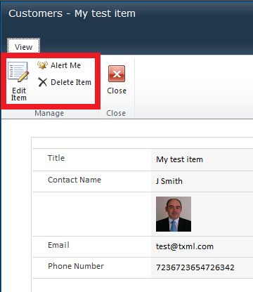
So I had a query about allowing users to edit items via InfoPath form but not Delete. This is a problem because by default the ribbon on the form has the edit and delete buttons together as shown;

As you've perhaps seen in recent articles it's possible to remove the ribbon but then you're stuck without your edit item button. There's always a catch huh? :)
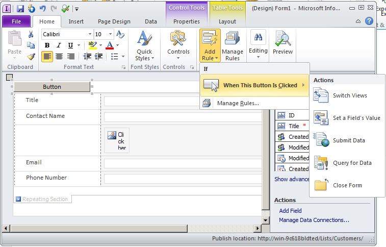
You can of course edit the form in InfoPath and add a button control. Sounds great, but there is no suitable option for the button that when clicked it will get us into Edit mode. Maybe at a stretch you could create an alternative view with edit capable fields, but I fancied something simpler!

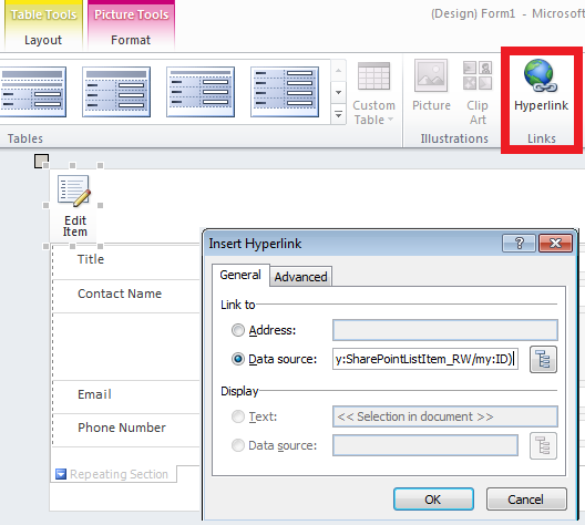
It occurred to me that all my button really needed to do was take me to the edit form that already existed. The edit form had a fixed url except for the item ID, so a hyperlink with a little tweaking would be enough, I didn't need a real button at all. To edit an existing item the hyperlink needs to have the ID of the item specified. Instead of a plain hyperlink you can create a hyperlink like this; concat("http://YourServer/YourSite/Lists/YourList/Item/editifs.aspx?List=YourListGuid&ContentTypeId=YourContentTypeGuid&IsDlg=1&ID=", dfs:dataFields/my:SharePointListItem_RW/my:ID) where the Guids you'll provide are all from the original form url. IMPORTANT: This link needs to be pasted into the Data Source box of the hyperlink, not the Address box! (See screenshot below). [btw thanks to James O'Connor who pointed out my original fubar with this :) ].
A plain old hyperlink would look kind of odd to the users though so a little slight of hand is required to make the link look like a button.
So for a really quick fix, I took a screenshot of the Edit Button from the ribbon like so;

I inserted the graphic above into my form. Then selecting the graphic and inserting a hyperlink turned the graphic into an image link that looked exactly like an edit button.

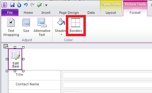
You do get a sucky purple border around the image link, but if you click the format option on the ribbon and select borders, you can clear the border so that just the image appears. (Who thought a purple border would catch on anyway? :D )

Now clicking the image that looks like a button takes you through to the edit form. Magic!
This is all a bit of a hack, but sometimes those quick fixes are all that's required. I hope this has given you a few ideas to get around those troublesome user requirements we all get bowled our way. :)
Happy SharePointing!
