Product Review: Collabion Charts for SharePoint

What’s it all about?
There’s been some interesting recent changes in the SharePoint Charting space. As mentioned here we're encouraged to use Excel Services in place of the humble chart web part in SharePoint 2013 (earlier version of the page said they were getting rid of it full stop!).
That's going to make charts less accessible to some folks -> not only is Excel Services an Enterprise feature, but a lot of IT departments don't like to enable it without a thorough capacity planning exercise to make sure their SharePoint farm can take it. Despite these travails for the IT Department the business are going to want to continue using charts! :)
Happily there's a thriving 3rd party market supplying alternative chart components and as luck would have it I was recently contacted by the folks at Fusion Charts who wanted to sponsor a post on Collabion Charts for SharePoint (2010 && 2013). How could I say no?
First Look; Collabion.com
Before I used the components my first impressions were gained from their website (http://www.collabion.com). I was genuinely impressed by the professional look and feel of the site and the wealth of information there. There were a number of videos showing how to install the tool and how to create charts with different data sources. Also a heap of documentation and screenshots. The site also features a rather candid 'About Us' page which is worth a read; http://www.collabion.com/about/
From all the above I gathered that Collabion is actually an old hand when it comes to charting software, and this new initiative to specifically serve charts for SharePoint is what's new. Though the online materials were pretty good I had one gripe about the site, in that the case studies they supply are extremely light, with typically three bullet points to highlight what the product did for the client. If I was building a business case for the purchase I'd want a little more, which hopefully is available on request.
Installation
So the downloaded zip files contain a WSP, setup.exe and other essentials. This is where I highlight the first gotcha; this is a Full Trust solution to be installed direct on your WFE Servers. The product in its current incarnation is not Cloud enabled. Admittedly the majority of SharePoint is still on-premises, but it's one to consider if you might make the leap to Office 365...
The install wizard was nicely slick and didn't take long at all. I was able to specify the Site Collection(s) to deploy to, and feature activation was taken care of by the wizard. At this stage you have the web parts available and are ready to go, but you're still on the trial version until you enter your key. Activating the product involved entering the key, specifying the number of Web Front End servers (as that determines the price) and then entering the server names. The last step seemed a bit unnecessary and meant digging around for what the names were, though I consoled myself that it was a one-time pain in the posterior. :)
Getting Started
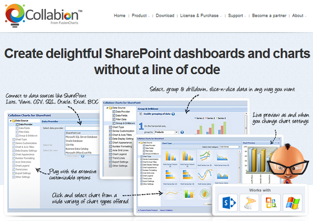
OK, so all was good. After creating a web part page I could easy add the Collabion Chart Web Part to the page. There's a link on the WP to open a configuration wizard, which offers much richer options than anything you get out of the box in SharePoint. Perhaps the first notable was the range of data sources that can be charted; SharePoint Lists (of course!), CSV, Excel, SQL Server, Oracle and Business Data Catalog. The wizard takes you through each step, or you can jump to any configuration you want by clicking on the left.
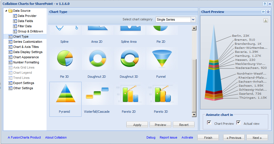
Once you've chosen your source data and fields there's a heap of different chart types available, 2D or 3D bar and line through to radar and pyramid representations. A neat little preview on the right gives you a sense of what the chart will look like. I won’t describe the full configuration process, suffice it to say that you can do very little configuration (choose data, choose fields, chose chart type, and save), or you can go to town with full customization of the legends, colors, look and feel, introducing drill down behavior and indeed if you expect it it's probably in there. Between pages in the wizard I experienced a little lag when saving settings. I put this down to the farm I tested on being a little anemic, but as ever, do your own research on hardware representative of your own production environment.
Upon clicking save I had an attractive pyramid chart on my SharePoint page. From install to first finished chart took three minutes, and as you'll likely be doing your install the users will get even quicker results. :)
Other Features
On the chart itself there is a link to export the chart as PNG, JPEG, PDF or SVG Vector Image. This struck a chord as I've often been asked by users about taking charts offline. With the OOTB charts I had to suggest users used the snip tool to copy the chart, so this is an advance worth mentioning. There was no direct print option alas, but you can't get everything I guess. Earlier I'd also specified drill down in the prior wizard step, so when clicking the chart itself I'm shown the average values of subsections of the data. Not sure I've seen this in another SharePoint charting tool, or certainly not this accessible.
Filtering
Next I began to think about linking the chart to filters. In web part properties there's an option to enable Dynamic Filters. This shows another link on the web part in display mode and ordinary users can click to specify filters (much as your click column headers in views to temporarily slice and dice the data). The filters could be multicolumn and therefore very specific if necessary. Once again this was a feature I could see the business lapping up. When it comes to filtering though it would be quite normal to use filter web parts connected to the chart to produce dynamic results based on query strings in the page address, text boxes, current user etc. Alas web part connections are not supported on the Collabion Web Part. :( This is an issue for me as a lot of the usual avenues I'd use to hack some interesting results aren't available. Consider this example in my YouTube InfoPath tutorial where a chart is displayed on an InfoPath form; Add Web Parts to InfoPath Forms . Unconventional I know, but also not possible with Collabion.
Wish List
Maybe I'm difficult to please but there were a couple of other use cases I couldn't master with the tool. Despite the rich chart types, there was nothing to map geographic data. If you see the example of the screenshot below I've put a Collabion chart and a data bound Visio diagram side by side;
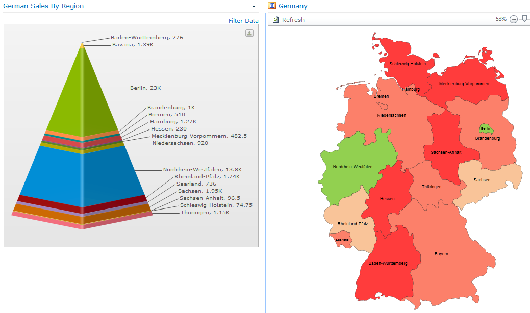
To truly cover the angles an Enterprise dashboard might need something like this, so perhaps you'd need to consider Visio Services in tandem with the charts. Just a thought, and perhaps a stretch for a chart component, but they were the ones that put the word dashboard in their literature and got me thinking about this. :)
Here’s one of their examples of a dashboard btw;
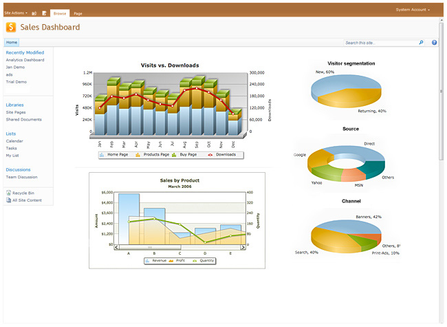
It’s gonna grab your business users interest. :D
Portability
Export and Import seems to have gained a lot of attention when these tools were put together. As well as the chart web part you also get web parts to allow you to batch export the charts on a page, and re-import elsewhere. This is nice in that any multi-chart dashboards you create will be fairly portable.
Cost
So a fairly comprehensive charting solution. How much does it cost? The published Production cost is 1299 USD per Web Front End, which compares with similar products like Bamboo Charts Plus. I also noticed a dev server cost of 399 USD per WFE. OK, often the dev environment will be smaller than Prod and the cost should be minimal, but paying for tools in dev makes me go :/ (I know some vendors charge full price for Dev environment components, don't worry I have an even frownier emoticon for them).
In summary then;
Pros
- Good website with plenty of video guides and docco
- Very easy to install
- Configuration of charts a dream, even for end users
- Ability to use data from a wide range of sources
- Attractive charts that will wow users
- Rich options on types of chart and configuration
- Nice end user tools like dynamic filter and export to PNG etc.
- Export/Import makes duplication of charts easy
Cons
- Standard web part connections not available
- Full Trust On-Premises only (No public Cloud)
- No direct printing of charts
- Unable to render geographic style data
- Cost for dev environment somewhere greater than my preferred zero dollars
Review in a Tweet; “A worthy contender to be the SharePoint Charting solution in any business”.
Happy SharePointing!